
EDITORIAL – Sure, we need more colour on our buildings, but how much?
An editorial by Mel Rothenburger.
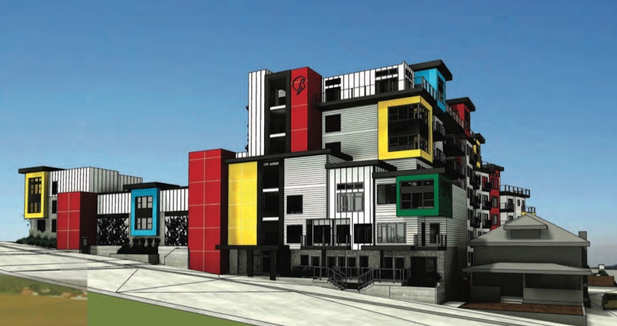
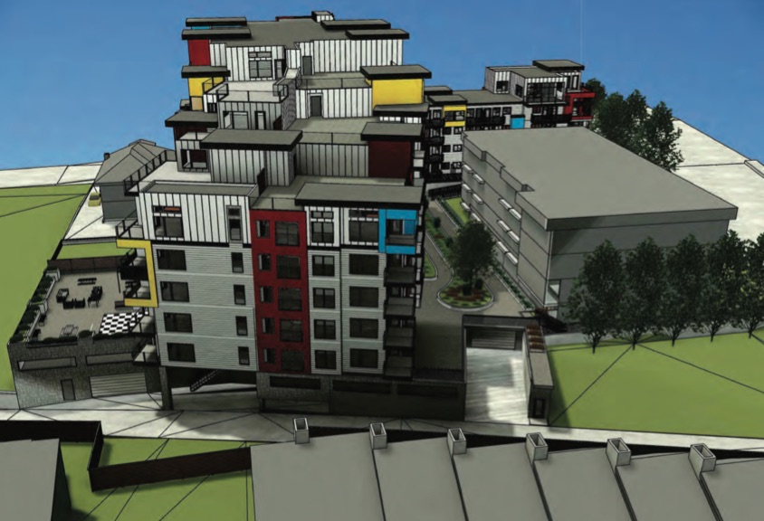
I’VE BEEN TRYING to figure out how I feel about a new development at the corner of First Avenue and Columbia Street that’s coming up for a public hearing.
The project is called Canary Lofts, two buildings containing 171 apartments and a 178-space underground parkade. It will provide much-needed strata and rental housing and will upgrade a part of town that has seen better days.
But, darn it, it’s the colour and design of the thing that I just can’t reconcile. I don’t want to sound unkind, because for years I’ve been complaining about the greigeness of buildings throughout Kamloops.
Both in residential and commercial buildings, earth tones are the rule of thumb because that’s what City Hall has always wanted. We must be a city of sameness, apparently.
(Image: City of Kamloops)
Mel Rothenburger is a former mayor of Kamloops, alternate TNRD director and a retired newspaper editor. He is a regular contributor to CFJC Today, publishes the ArmchairMayor.ca opinion website, and is a recipient of the Jack Webster Foundation Lifetime Achievement Award. He can be reached at mrothenburger@armchairmayor.ca.

Looks like Lego land. The colours need to be muted.
LikeLike
Kind of refreshing, actually. Besides, colours can always be changed if they are THAT objectionable. Key is actually getting the project approved and built, which would also be refreshing :)
LikeLike
The design and Colour scheme is Awesome , about time things have a different style!
LikeLike
I love this colour scheme! Let Kamloops SHINE! Enough of the grey/brown/sand/BEIGE that has become the norm!
LikeLike
The color scheme is fantastic. A law should be passed where a minimum of three bright colours are strategically chosen for every building in town. We must stop the drabness of this city to continue.
LikeLike