
ROTHENBURGER – The best and rest of civic election campaign signs of 2026
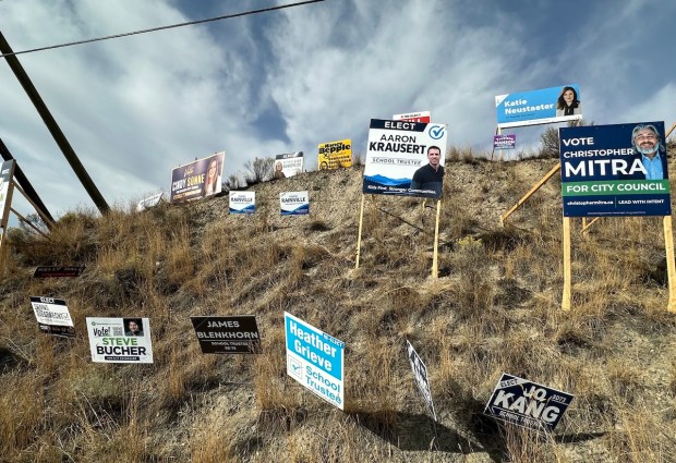
(Image: Mel Rothenburger.)
AND THE ENVELOPE please. It’s time for the Armchair Mayor’s campaign sign awards. Since 2008, I’ve been issuing reviews of campaign signage in every civic election.
 Those signs are much maligned but oh-so-important, especially to newcomers struggling to make their names known. In other cities, candidates have sometimes opted for a bit of humour, like the fellow in Kelowna whose slogan is “How hard could it be?” The candidate, Brady Rogers, also uses slogans such as “I barely want to do this” and “Fine, I’ll do it.”
He’s getting a lot of attention but Kamloops candidates are playing it straightforward and serious. This year, the landscape is more cluttered than ever before with election signs, making it harder for anyone to stand out from the competition.
This is also the first AI election. Signs of it, so to speak, are everywhere. Candidates are taking advantage of the new technology to make their signs pretty. That’s not necessarily a good thing, which I’ll explain.
First, though, some election-sign basics. As I’ve written in elections past, candidates make a lot of mistakes with their signs. Those who avoid those mistakes have the best chance of making an impression on passersby.
And let’s remember, while lawn signs in residential neighbourhoods do still exist, they’re only a very small part of the election scene. Campaign signs are almost entirely for the purpose of catching the eye of drivers travelling at 60 clicks. That allows approximately one second to read election signs as they drive by.
The average human is capable of absorbing 5.91 words per second in normal, undistracted reading. If we try reading really quickly, we can reach 8.21 words. Good luck trying to pick out anything from a cluster of 20 or 30 signs.
So signs have to be quick and dirty, as the saying goes. This is the Number One consideration when designing signs, and many if not most candidates don’t know it or don’t think of it.
The second key criterion is the font used in the lettering. It must be bold and unadorned — no serifs, italics or fancy stuff. No condensing (i.e. squeezing) if at all possible. Something along the lines of a plain bold Arial or its older cousin Helvetica will do nicely.
Now then, colours. No pastels. Too many pastels lining our roadways this season. They look washed out, flimsy. They disappear into the surroundings like camouflage. School trustee candidate Bonnie McBride is maybe the best example of that — her signs are almost impossible to notice. Primary colours only, please.
And shapes. Don’t get too creative here. Square or rectangular is best. Round just looks awkward. Jaggedy edges are annoying. This year, thankfully, everybody is sticking to the tried and true.
While it’s tempting to put your photo on your signs, caution is advised here. Pictures can hog a lot of valuable space. And please — and I can’t stress this too much — don’t get carried away with your new AI toy. Leave the pretty background mountains, lakes, rivers and trees out of it. They just make the words harder to read than they already are.
Some tips on those words. Remember what I said about the 5.91 limit of our brains, or 8.21 if we speed read. Resist including your slogan but, if you must, have a slogan that’s tight. Three words is best.
Most slogans are meaningless anyway. “The name you trust” (Dale Bass), and “Thoughtful leadership. Sound counsel” (Margot Middleton) sound more like bragging than a platform. “Kids first. Stronger Communities” (Aaron Krausert, school trust candidate). Doesn’t every other school trustee candidate, incumbent or otherwise, want that?
A better one is that of fellow school trustee hopeful Troylana Manson, who advocates “Listen, Learn, Lead.” That suggests a strategy for how she’ll make good decisions.
“Your City Your Voice” (Rob Bertrand), is a nice thought, but are you saying you alone will be the voice of the people? What are the other eight council members, chopped liver?
One I rather like is Christopher Mitra’s “Lead with Intent.” Three words, gives the impression he has an analytical, purposeful way of making decisions. Another is the Pivot Kamloops slogan, “We’ve got this.” Makes one think that maybe they’ve got a plan, and have the ability to fix what’s wrong. (It’s kind of a serious version of “Don’t worry, I’ll fix everything,” which is another of the slogans being used in Kelowna by council candidate Brady Rogers, with the small-print disclaimer, “Terms and conditions apply.”)
What passersby need to know from your sign is your name and what you’re running for. They don’t have the time to absorb your life story, yet some of the signs out there try to outline entire platforms.
Do your signs really need to tell the world that you want voters to “Elect” you. Why not just tell them you’re running “For” council, mayor or school board? In fact, you could even drop the “For.” How about “Joe (or Josephine) Blotz, Council”? Of course, if you’re determined to ask them to “Re-elect” you so they know you’ve already been elected in the past, you’ll have to make room elsewhere.
Despite all of this advice, some campaign signs break the rules but still manage to be effective.
So who’s got the best campaign signs in 2026? Keep in mind there are big signs and little signs, and some candidates have both while others only one or the other, so I judge them all together.
A couple of honorable mentions first. One of them belongs to Brian Andrews. His signs aren’t pretty, his font is all wrong and the colours are jarring but they stand out. The white lettering on orange and green background is an easy read, and he uses only five words to tell you, “Vote Andrews for City Council.”
Note, he doesn’t include his first name. There’s only one council candidate with the last name of Andrews.
Another one I thought was terrible at first but appreciate it the more I drive past it is that of school trustee Deb Piggin. It’s almost endearingly amateurish in appearance and uses a main font that’s both italic and serif but her name in blue stands out nicely against a plain white background. Unfortunately, she adds clutter with “Experience that matters. Leadership that Listens. Students First.” Way too long.
And the winners are
And now for the winners.
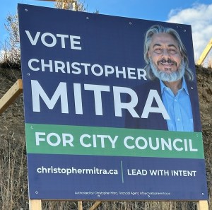
Runner-up.
THIRD PLACE: Cindy Sonne manages to include her photo and words “Vote Cindy Sonne for Kamloops City Council” without it looking crowded. The deep blue and orange colours are great and her name really stands out. She does make a mistake by adding a stretched-out line underneath that tells us of “Municipal Election Day, Saturday, Oct. 17, 2026.” I understand the reasoning — seems like a good idea to remind people when they should come out and vote for you. I did the same thing myself in one campaign. The two things wrong with it are that it adds unreadable clutter, and the next time you run the election will be on a different date, meaning you’ll have to get new signs or get patches for them to change the numbers.
SECOND PLACE: Christopher Mitra, like Cindy Sonne, includes a photo of himself on his bigger signs, along with the simple message, “Vote Christopher Mitra for City Council.” Bang on the maximum wordage. And his choice of blue and green work really well. He does, though, include, in tiny letters, his “Lead with intent” slogan. Impossible to read it unless you stop your car, put on the flashers, and walk right up to the sign, which isn’t something I recommend in traffic.
FIRST PLACE: Goes to mayoral candidate Ivory Winston. A bit of a surprise and somewhat unconventional winner, perhaps, but this one manages to stand out from the crowd. Driving past, it’s easily distinguishable from all the other signage around it. That’s partly because of its shape. Instead of square, it’s a long rectangle. No photo. No first name. Just ‘Winston for Mayor.ca.’ There are no bright colours — in fact, the one sign I’ve seen appears to be on plexiglass, but it works. Maybe it’s the only one he’s put up, but there’s no rule in the Armchair Mayor Sign Awards that sets a minimum number of signs. The only criticisms I have are that the sans serif font could be bolder, and that he adds an unnecessary and wordy slogan: “Respect. Integrity. Truth. Love.” However, it doesn’t detract from the simple information that a guy named Winston is running for mayor.
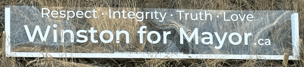
A note about websites
In this day and age, the Internet is as important as any other cog in the campaign wheel, and this year there are some very good websites. The most complete and informative belong to mayoral candidates, like Nelly Dever, Mike O’Reilly and Ivory Winston. Some of the council candidates have informative ones, too.
But the most impressive one of all? Far and away, it belongs to incumbent Mayor Reid Hamer-Jackson. His hamer4mayor.com is attractive, easy to understand, and he turns council turmoil into a plus with his plea to elect a council he can work with. “The right team changes everything,” it says.
So, that’s it for 2026. For those who didn’t make it to the finals, there’s always next time. See you in four years. Good night.
Mel Rothenburger is a former regular contributor to CFJC-TV and CBC radio, publishes the ArmchairMayor.ca opinion website, writes for the Kamloops Chronicle and is a recipient of the Jack Webster Foundation Lifetime Achievement Award, and was a Webster Foundation Commentator of the Year finalist. He has served as mayor of Kamloops, school board chair and TNRD director, and is a retired daily newspaper editor. He can be reached at mrothenburger@armchairmayor.ca.


Leave a Reply