
As the years pass, buildings in Kamloops just keep getting more and more and more beige
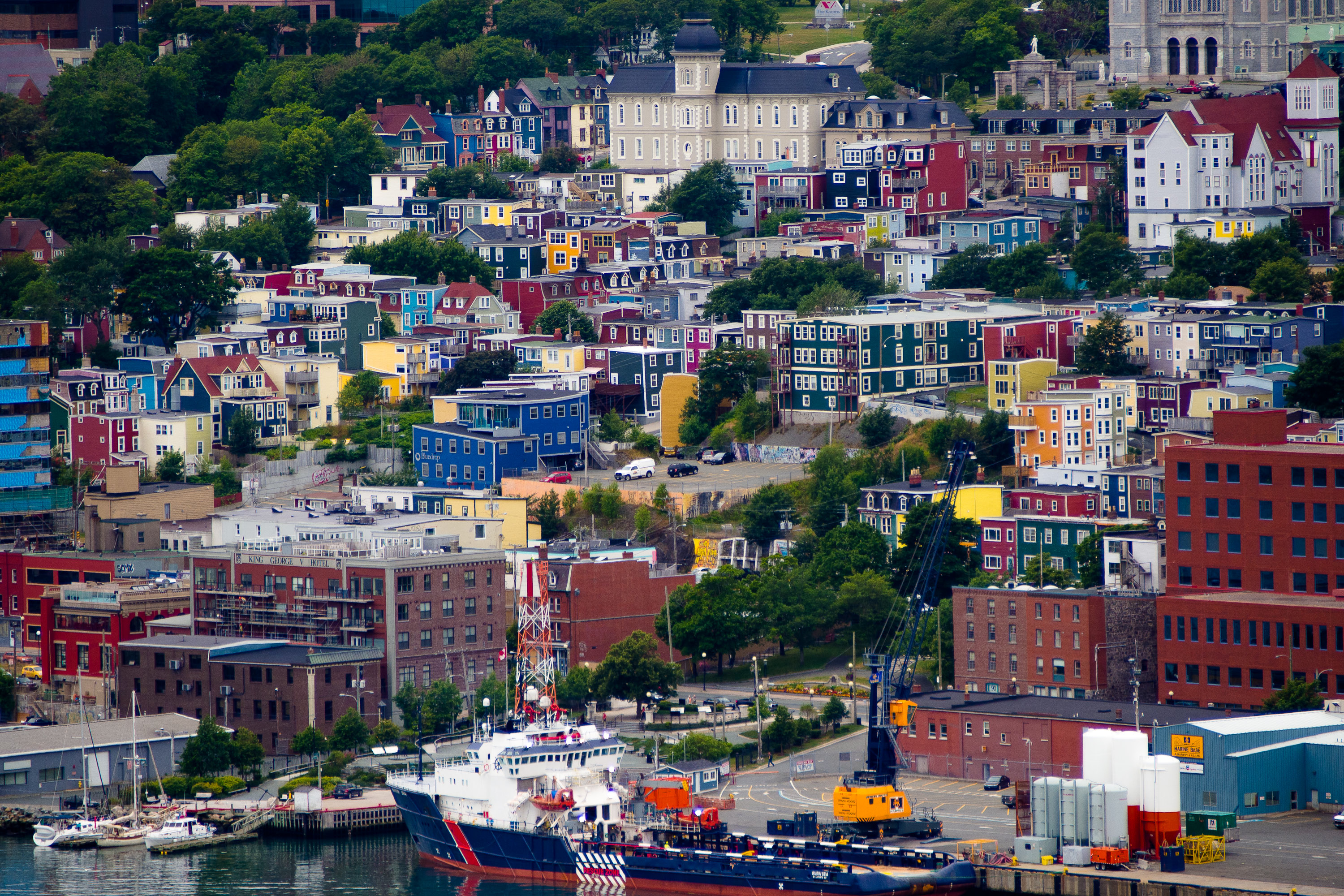
In St. John’s, Newfoundland, they how to use colour. (Wikipedia)
THE CLIPPINGS FILE (COLUMN) — A few years ago, in despair over the beigeness of our city, I issued a public plea to Tom Gaglardi not to make the new Signature Sandman Hotel beige.
Well, the hotel is nearing completion — the opening is expected early next month — and there’s just a little beige on it. The rest is grey and charcoal.
It’s a fine hotel and a good addition to that part of town but it follows the “earthtone” tradition of buildings in Kamloops because that’s what City Hall likes to see.
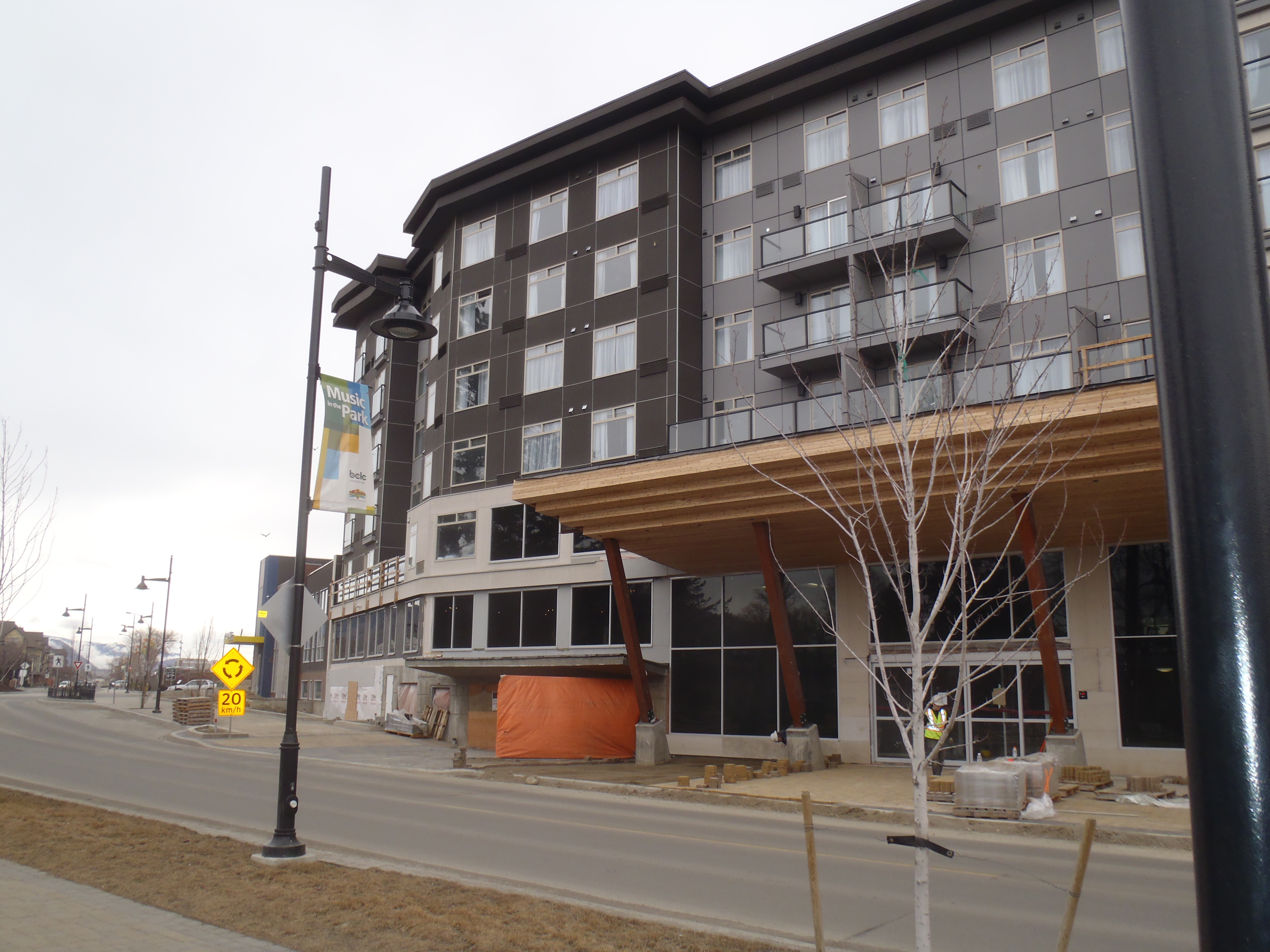
New Sandman Signature. Nice hotel but…
This still bothers me. Earth tones are safe, but they’re sure not exciting. They’re like the paint versions of tranquilizers.
When the Canadian Mental Health Association was planning renovations to the old Rendezvous Hotel to transform it into the Emerald Centre shelter shortly after the following column was written, plans had to be changed. The CMHA wanted to paint it emerald green; the City wanted, of course, earthtones.
A compromise of sorts was reached, with a hint of colour on the building but its subtle.
The column that follows was first published in The Kamloops Daily News on Nov. 23, 2010 and, while it’s a bit out of season with its references to Christmas, the point is the same.
Kamloops, in spirit at least, isn’t a beige kind of town. We should free ourselves to experience the beauty of colour.
By MEL ROTHENBURGER
I would like to know why beige is the required colour for houses and offices and public buildings and hotels in Kamloops.
Did City council pass another bylaw? Maybe an addendum to its “no chickens” regulation?
My neighbours’ houses are beige. Our city’s newest hotel is beige. (Please, Mr. Gaglardi, make your hotel anything but beige.)
If a Kamloops building isn’t beige, it’s white or grey. That’s as adventuresome as we get in these parts.
I may have found out last weekend why we love beige the way we do. Syd and I enjoyed the Homes for the Holidays tour in which a half dozen local homes are decorated for Christmas by local stores and designers – truly delightful.
One of the houses on this year’s tour is a heritage home built by William Slavin on West Seymour Street before the 19th century turned into the 20th.
As long as I can remember, that house was painted a benign white, a colour people insist on painting old houses. New owners restored this beautiful old house and returned it to its original colours — bright red siding with green trim.
It was a brave thing to do, since it stands out among ordinary houses with ordinary colours like a bright red Christmas ornament on a pallet of brown. And that’s the thing — nobody likes to stand out, nobody likes to take risks.
That house is a risk, and a wonderful one. It’s a statement; it brings energy to the entire street. Few would have the courage to paint a house bright red with green trim in Kamloops.
No, we prefer to play it safe, but it has its downsides. Have you ever tried giving someone directions to your house? “Ours is the beige one.”
Remember a few years ago when the Plaza Hotel got a new paint job? It caused a minor controversy because it wasn’t beige.
When Tina Lange became a part owner, one of the first things she said she wanted to do was repaint it beige. Or, at least, something less jarring than its current peach.
I can count on the fingers of one hand the number of buildings in Kamloops that are not beige, grey or white. That’s not the way it is in other parts of the world, where people appreciate colour in their buildings.
Newfoundland is one of them. How wonderful their streetscapes are with each house a different colour — blue, green, yellow and blue. No white, no beige.
I thought I might find more explanation of our fascination with beige, but there’s surprisingly little available. One blogger does describe beige as “the colour of evil.”
(His explanation goes something along the lines of white being the colour of virtue and beige trying to look as much like white as it can.)
Another website asks why the original computer colour was beige (the answer is obvious — manufacturers were playing it safe); another wants to know why beige computers turn yellow. Not much help there.
Abandoning my “why beige?” query, I turned to “define beige.” It’s described as “a light grayish brown or yellowish brown to grayish yellow.”
Does that sound inspiring?
The one thing beige has going for it is that it totally suits today’s uninspiring architecture. Clearly, architecture students are being taught that all new buildings, especially public and commercial buildings, must be square with aluminum-clad windows and beige stucco.
Throw in a false front at the entrance and we’re good to go.
No, our forefathers had the right idea. Give me a multi-coloured classic Queen Anne or an angular Craftsman over today’s boxes any day.
And hat’s off to the fellow who put orange stucco on his house in Westsyde. It catches my eye every time I drive past it. You, sir, are clearly a man who eschews the ordinary.
Would there were more like you.

I live in the GTA and I want to have my beige looking siding painted Newfoundland red!! I’m sick of neutral colours. When I have some interior painting done. I’m going to have pops of colour.
LikeLike
When it comes to color, something that should be used to set us apart, Kamloops is BORING. In answer to the statement ” Another website asks why the original computer colour was beige (the answer is obvious — manufacturers were playing it safe); another wants to know why beige computers turn yellow. “,
that’s because computers want to be any color other than beige, even if it is dust stained yellow.
LikeLike
Beige is so inoffensive that it is offensive.
LikeLike
Painting with colour rather than beige seems to go hand in hand with an acceptance that you are painting for yourself and not for the future owners of the structure. Beige is the colour of choice if you are preparing a building for eventual resale. Colour says, ” This is mine, I am staying”.
The trim on my house recently changed from brown to a bright navy blue.
LikeLike
I’m proud to say our house is the most colourful on the block. Yellow with purple/black trim & a red front door was a bit of an adjustment for our neighbours. But we love it. Reminds us of old mining communities in the Kootenays.
LikeLike
Great idea Mel. There’s a St John’s postcard on my fridge of the Archives-Art Gallery-Museum and houses. The size contrast grabs your eye and then the colours.
In the early 70’s our home wasn’t beige but five different surfaces and colours were visible upon entering so we did the inside floor with red carpet with a blue chair and a gold couch. We really enjoyed the improvement. Still have the blue chair.
LikeLike