
EDITORIAL – Why we should be very proud of the Maple Leaf on flag day
(Image: Mel Rothenburger)
An editorial by Mel Rothenburger.
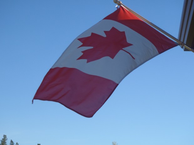
WITH MUCH PRIDE, I put our flag up last night, so it would greet National Flag of Canada Day bright and early. I love that flag; I install it ever year, hanging from the front porch, and it waves — come gentle breeze or torrential storm – until I take it down when winter approaches, lest it be ravaged by the icy weather.
Technically, I’m supposed to take it down every night but it does fine 24 hours a day. This year, though, I’ve put a brand new one into service. On the other corner of the porch, I will hang a Ukrainian flag in honour of my ancestry and in recognition of the terrible ordeal that country is suffering at the hands of the invading Russians.
Later, I’ll put up my Red Ensign as well, and maybe a Union Jack, alternating them through the season beside the ever-present Maple Leaf.

Runner-up in Canada’s flag competition.
I admit I wasn’t a fan of the Maple Leaf at the start, when it was unveiled in 1965. I much preferred one of the alternate designs that were considered – a three-pronged branch of three smaller red maple leaves on a white background with narrow vertical blue bars (symbolic of “coast to coast”) on the sides. I liked the addition of blue, and the symbolism of three maple leaves joined together. It was nicknamed the Pearson Pennant.
Another design was close, with one large maple leaf and blue bars. Many others employed maple leaves, while others used the beaver, or northern lights or geese. But it was the design of a stylized maple leaf with two broad vertical red bars that won the day.
Over time, it grew on me. The one big maple leaf and red bars is a wonderful, simple, easily identified symbol for letterheads, military insignia, backpack, documents and such.
An article by the National Post this week extolled the virtues of our flag. Quite simply, it checks all the boxes of what a flag should be. There are standards for flags, established by the North American Vexilological Association. As explained in a National Post article this week, there are basic differences between “good” flags and “bad” flags.
A good flag should be simple enough that a child can draw it from memory. “On this rule alone,” concludes the articles, “Canada blows past all its usual peer countries.”
Secondly, a flag must reflect “meaningful symbolism.” The Maple Leaf has been a symbol of Canada for many decades, from the War of 1812 through two world wars.
Thirdly, a flag should be limited to two or three basic colours. Check. (But, remember, the Red Ensign breaks this rule – it has five colours).
Fourth, there should be “no lettering or seals.” In wind and rain, it must be easily identifiable. Lettering makes it so the flag can only be seen correctly from one side.
Finally, a flag must be distinctive. Not an easy thing to accomplish. It’s hard to tell the difference between many European flags, for example, which simply alternate colours.
So, yes, we have a “good” flag. No, a great flag. The fact the international “rules” for flag design didn’t come into being until after our national flag was created highlights the vision and clear thinking of those who adopted the Maple Leaf.
We don’t usually pay much attention to National Flag Day but this year is different. Today, we fly the Maple Leaf with pride.
Mel Rothenburger is a former regular contributor to CFJC-TV and CBC radio, publishes the ArmchairMayor.ca opinion website, and is a recipient of the Jack Webster Foundation Lifetime Achievement Award, and a Webster Foundation Commentator of the Year finalist. He has served as mayor of Kamloops, school board chair and TNRD director, and is a retired daily newspaper editor. He can be reached at mrothenburger@armchairmayor.ca.

I am proud to be a Canadian citizen and the Maple Leaf always stirs positive and strong emotions. However we could do better and we should have our own DOGE federally, provincially and municipally.
LikeLike
I love our country and our flag and what it stands for. I drove around today to see how many places fly our flag. I was so disappointed at how few there were. Many flags were tattered and sorely in need of replacing due to wear and tear. Come on Canada, take pride in our flag and country. Fly our flag proudly and take care of it and remember it could easily be a flag of another color.
LikeLike
A lot of national pride has been built around our flag, Mel. Way too much to roll over and play dead now because of some bully.
Thanks.
LikeLike